
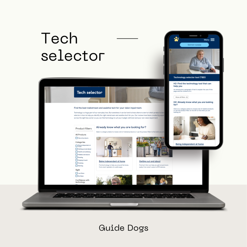
What is Tech selector?
Tech Selector is a web-based tool designed to provide unbiased and tailored information on technology that can help people with vision impairment find the best tools out there to help with a variety of tasks. This is an important project in the sight loss charity sector, with outstanding reviews on accessibility and usefulness to the target audience.
My role in the project
As the single UX designer on the project, I conducted user research, product categorisation, wireframing, and prototyping. I helped with usability testing to ensure a user-friendly and engaging web tool was developed. I also was the only web producer working on this project so, once all the background work was done by the devs team it was my responsibility to build 32+ pages within a tight deadline.
Constraints and pain points
1. The stakeholders were not sure what they wanted
The design brief given to me was extremely loose with no concept in mind apart from the fact that it needed to match the current Guide Dogs brand guidelines and the look of the pages. This meant I had to take the initiative and ask several questions to best understand the requirements. I then came up with initial design drafts and multiple prototypes on Figma to help the stakeholders visualise and understand the product better. It was a great discovery phase.
2. Multiple refinements due to the various charity partners
Once the initial designs were created there were a lot of refinements that went into this project because of the various charity sector partners involved. However, the majority of the work was done by Guide Dogs and the product was to be hosted by us as well. The marketing and some case studies were provided by other charities to help develop this product. This dynamic meant that I was constantly refining the designs along with presenting changes directly to charity CEO’s on multiple occasions.
3. Restrictive CMS
This tool is built on Sitecore CMS which is pretty restrictive in terms of what design elements we could use on the pages. The Guide Dogs website doesn’t have a check box filtering functionality built in. So to be able to give that to our end customers it needed designing. This is where the agile way of working and working in a scrum team really helped me connect with all parties involved. At every step of the designing process, the devs team and I were constantly coming up with ideas to help solve the limitations of our system while delivering a product that matched Guide Dogs TOV and branding perfectly.
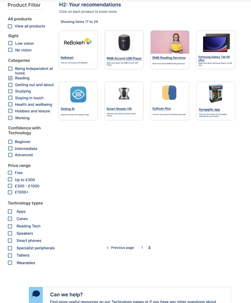
4. Too many checkbox options which made the filter list too long
Initially, the stakeholders wanted a large list of checkboxes under product filters. This meant that there would be a large amount of blank space on pages where we didn’t have enough product results to display (example below.) This would confuse our magnification users who use high-screen magnification to help with their limited vision.
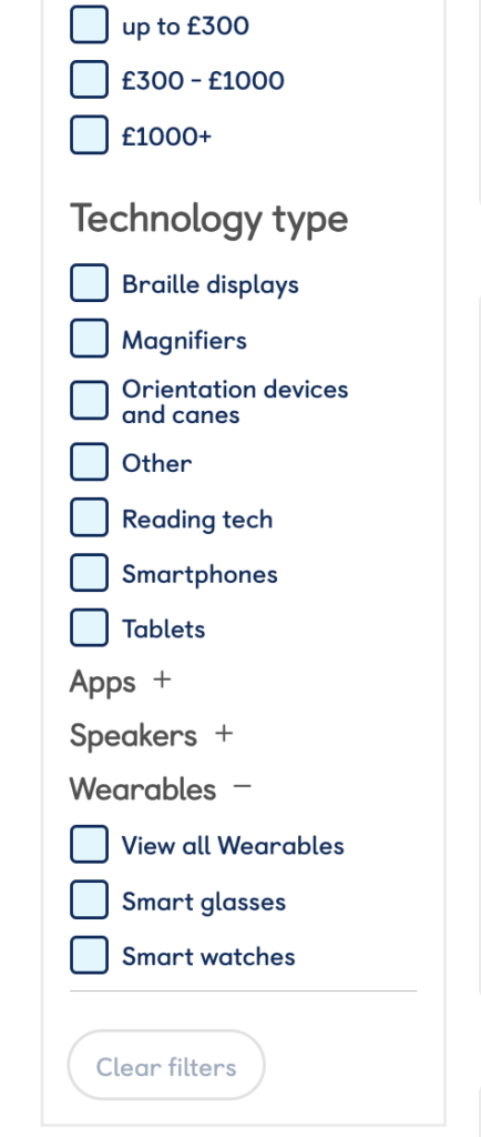
To solve this I proposed a solution to create collapsable filters with a parent-child relationship, which helped us group certain technology types that worked well (see example below.)
5. The page focus jump created a poor user experience for magnification users
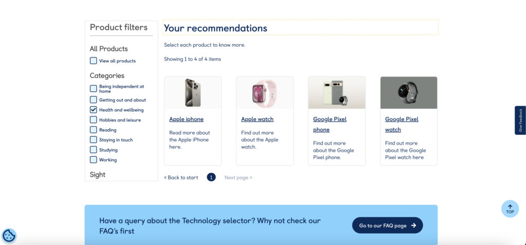
After meticulous user and accessibility testing, we had a major dilemma, where the users who relied on screen reader technology mentioned that the focus of the page should jump to the top once the results were filtered. This would aid the screen reader tech user with identifying the products and for the reader to read it aloud to them. This was a critical requirement which was implemented quite quickly with front-end devs help.
However, it was then found that the page focus/page jump to the top was creating a poor user experience for magnification users who would have to scroll down a lot every single time they clicked on a checkbox. And this constant jumping to the top of the page was really frustrating for them.
This was a huge dilemma because it seemed like we needed a middle ground and there was no other solution in sight. After a lot of research, I proposed that we encase the filters in a section which would be dynamic so that the section could always align with the product results. This would then trigger a scroll bar to appear on the filter section so that even with the page jump the magnification users don’t have to scroll down much. Which was the best of both worlds and was received successfully by both user types. (Example below: the scrollbar hasn’t been captured in the screenshot but a grey line appears on the right side of the product filter section on hover. )
Learnings
Overall this project has been an incredible learning curve for my UX design journey and now that the project is live it’s been amazing to see how the design decisions I helped make are making this project a huge success for my employer. This project also helped me get comfortable with stakeholder management and managing people’s expectations. This was a great opportunity to strengthen my Figma skills and experience end-to-end project delivery in an agile manner.